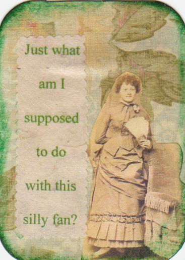
Here's an ATC swap that I just finished creating my pieces for. I generally don't share all of them, but all of these just made me chuckle, so I thought I would this time! Just click on the image if you can't read the saying in the smaller photo. No more words from me on this one!
Enjoy!
This ATC swap called for a cat (or cats) to be the subject, and also have some text reflecting whatever thoughts just might be going thru their little kitty minds! Altho all the ATCs that I made for the swap didn't involve my little kitties, those are the ones I'm sharing on this blog! The above ATC is of Toutle, when he was just a wee little baby kitten. He was lying in wait to attack me, behind a fake greenery potted plant I had on the floor of my office. He has certainly lived up to this quote, tho! What a character he is....and I wouldn't have him any other way!!
This ATC, above, is of my other little darling kitty, Tatoosh, the very first day she was home with me! She loved to curl up in baskets and small dark enclosed places (and in my lap). And, she is the princess, and is just a sweet little girl kitty!
This is also Tatoosh, in one of her less princess like moments. Still, it speaks to just how relaxed and safe she feels here at home (she was a neglected kitty for the first few months of her life, so was a bit skittery when I first got her). And, no matter how wonderful, every kitty has that kitty attitude of what's good for you is just fine for them, too, and I guess that includes laying around and vegging! (Altho I'm sure she's imitating her "dad", Jeff, here!! LOL - sorry, sweetie!!)
Enjoy!
 Welcome to the July Bizarre Holidays! I just am loving this ongoing swap theme - here are 3 I did for July. The one above is Flitch Day. Apparently, this was a custom that came over with the pilgrims. A slab of bacon was offered to any couple who could truly say they lived together happily for the previous 12 months. The couple in the card are my parents who lived together happily for far longer than 12 months, so they clearly would bring home the bacon!
 Here's another fun holiday - Clerihew Day. According to the history of this day, a gentleman with the middle name of Clerihew (I'll bet that one won't make the most popular baby names!) would make up silly rhymes with the AABB rhyme pattern. These rhymes would be mainly about himself, but then others began doing it about famous people. The lines can be of random length, both short and long. I just couldn't resist making up this little rhyme about this rather angelic looking young lady!
 And, finally, Amelia Earhard Day. I'm not certain that spelling of her name is correct, but it's what's shown on the Internet for this holiday, so it must be true! (LOL!) I've always thought she was a pretty cool lady, and her death a great mystery, so I just felt I had to honor her day with an ATC. The background of the ATC is a piece of an aviation map - very appropriate for her. Plus, with a pilot in the house, I have tons of outdated aviation maps!
Enjoy!
 For this ATC swap, I had to apply a new technique - beeswax! Basically, using a small craft iron, I melt the beeswax onto it, and then onto my ATC backing (a playing card). I then add layers of tissue, using more melted beeswax. The first image, above, is actually my favorite of this exercise, and the image of the woman is not on tissue, but thinner paper. It was the "ghost" image left after I used a transfer liquid for a previous project. I just love the feel of it, tho.
 The second ATC uses a number of layers of flowered napkins. I couldn't get any of them to really pop as the subject, so again, I cut a rose out of a garden mail order catalog, and just adhered that to the top of the layers with the beeswax.
 This third ATC was made up of napkins with leaves on them, layering one on top of the other, with a red leaf on the very top - sort of like a pile of leaves after you've finished raking them in the fall.
Enjoy!
 This was an interesting swap to participate in. The theme was to create abstract ATCs using only torn paper - no cut edges, no pens, inks, images not included on the torn paper, etc. Sounds easy, and it is.......
 ....except that old habits die hard!! I kept wanting to add something not "allowed" to these! But, what fun I had creating them. I decided that since it was to be abstract, I'd really "go" with that idea and took a large sheet of watercolor paper. I then made what I call serendipity paper. Serendipity paper is when you just put items (paint, stamps, images, paper, etc.) on a large sheet of paper in a quick fashion, no thinking allowed! In this case, the serendipity paper was made only using paper that had all edges torn. I used whatever papers were in my "stash" of leftover papers from previous projects. There were handmade papers, Jeff's old aviation maps, regular maps, book pages, music pages, napkins (one of my favorite things!), tissue, old dress pattern paper, etc! After I filled the watercolor paper.....
 .....I let it dry. I then turned the watercolor paper upside down, and cut out ATCs in the appropriate size (2 1/2" x 3 1/2") - I just cut as many as the watercolor paper sheet allowed. I then turned each over to see what the "abstract" turned out to be. I found I was very pleasantly surprised by the results. I then looked thru my old book pages and tore out words or phrases that appealed to me and added them to the ATCs for the finishing touch! What fun!!
Enjoy!
 Here are some ATCs (Artist Trading Cards) that I made for a swap with the online group I belong to - www.atcsforall.com. The theme for this swap was to alter the face of a playing card. The rule was that at least one corner of the playing card had to remain visible. For each card, I first sort of painted over the playing card with a brown/copper color. I didn't try to cover the complete card, just sort of tone down the white of the cards. For the above card, I then applied some cool napkins that had ferns or palms on them, making sure to leave that corner visible. I then paged thru some National Geographic magazines I've inherited from Jeff and found this great shot of a tiger's eyes, just the right size for this ATC. Just fyi - ATCs are only 2 1/2" x 3 1/2" (which just happens to be the size of a typical playing card!). I call this one "Jungle Kitty".
 For the above ATC, I printed this photo of mine. It's actually a photo of some trees in winter reflected in a pond at The Morton Arboretum, when we lived in IL. I printed the photo on some dress pattern paper, which is what caused the dotted line on the ATC. I took advantage of that to put the verbiage on the ATC. There's something about this ATC that strikes a cord with me. I think the trees look kind of ghostly.
 This ATC is just such a fun one. I took a napkin that I had that had the words "Coffee Bar" on it, along with a fancy coffee machine. You can't really see the coffee machine, but it's there in the middle of the ATC. There was an empty space just crying out for something to be there, and as I paged thru an old magazine of mine, looking for (I thought) a cup or cup and saucer, I saw this woman in an ad for, I think, carpeting or something. Anyway, she just sort of reminded me of how coffee drinkers seem to love that brew! I'm not a coffee drinker myself, so if I got this wrong, sorry, coffee drinkers!! It just shows you that I don't know "Jack" about coffee (sorry, couldn't resist!).
Enjoy!
 This was a fun project! It makes paint appear to be peeling off the card foundation. I decided to use various printed papers - music, book pages, phone book, etc. - as the foundation. I then applied Vaseline to the areas that I wanted to show thru after I applied paint. Then, came the paint. After it dries, I took a paper towel and wiped off the paint from the Vaselined areas. I then rubber stamped on top of all that.
 I then used some old photos that I had that kind of spoke to me in a fun way. Don't you love the "girls" in the first photo - bathing beauties on vacation! The little guy, above, looks like a little speed racer in his toy car! After I adhered the photos, I again applied the Vaseline technique with a second paint color. I just wanted the effect of many different layers!
 The last application was a rubber stamp that gives it a marble-like effect that also accentuates the peeling paint effect. The photo is of a young man with a sailing boat in the background. I like to think of the boat as being his "dream". A bit different than the rather formal, dressed up image.....exactly what you'd sort of expect his dream to be like!
Enjoy!
 Here's a new series that I worked on a week or so ago. I wanted to do something very simple, and sort of hit on this approach. I'm not certain that I really like it, altho it does kind of have a good "feel" to it.
 The photos are mine. I altered them a bit, and I do like the look of them. The one word aspect of it feeds into the simplicity that I was looking for and speaks to the photo image on the piece.
 The foundation of all the pieces are wood plaques that Jeff cut for me. I think I may do another series like this, but try something a bit different. Of course, there's always the chance that this will grow on me!!
Enjoy!
 These ATCs have the requirement that somewhere in the piece must be some sheet music. The above ATC has the sheet music as the background for the piece, with some really soft, pastel like tissue paper over it, and a flower stamp (colored in with blue, just to stay with the theme) and some blue handmade paper as the border around the "picture" of the flower. I just love the feel of this one.
 Now, this ATC has some very dramatic, bold red as the background and just a snippet of sheet music in it. I loved the soft contrast the lace seemed to lend to the piece, and the little do-dad laid over the handmade paper in the lower right of the piece reminded me of the treble clef in music.
 And, this final piece just seems like such a happy piece and absolutely reminds me of spring! Again, the sheet music is the background with tissue and handmade paper laid over it. The yellow tulips just sing of spring to me, and I couldn't resist adding the trim piece that seems to be little white daisy type flowers, also a very happy flower!
Enjoy!
 This swap required each ATC to have a pocket included with some type of surprise in the pocket. I chose to have the surprise be a fortune that I collected from fortune cookies. This fortune spoke to opportunity knocking on your door in the near future. So, I included an image of a mission in Texas that I took a few years ago to complement the fortune in the pink pocket.
 This fortune spoke to the likelihood of travel to exotic places for the lucky person who opened it (not necessarily me - I collect them from everyone!). So, of course, I had to include some decorated paper that looked like a passport page and postage stamps from countries other than the US.
 This last fortune spoke to receiving a cheerful message soon. So, I used a handwriting rubber stamp for the background, and made the pocket with some dark brown handmade paper with lace laid over it to create a more romantic feeling.
Enjoy!
 These ATCs had the theme of "hearts". A heart (at least one) had to be include in each one. For this first one, I used a heart cut-out made with heart printed paper. It's mounted on dyed dryer sheets and then on a background that I painted with a few different colors. I'm sure the young lady within the heart was someone's valentine!
 For this second ATC, I loved the look of some metallic-like papers I had and decided to make some nesting hearts, like the Russian nesting dolls.
 This ATC is kind of fun - I used a texture rubber stamp on some handmade paper and then cut it out in the shape of a basket. The hearts were made by using a rubber stamp on some dyed baby wipes and then cutting out the hearts. I just kind of piled them up to look like they were just tumbling out of the basket!
Enjoy!
 Here are some ATCs that I just finished today for a swap at www.atcsforall.com. The theme for this swap was book page backgrounds - the backgrounds for each of the ATCs are pages taken from old books. This ATC had a book in German (I think) as the background. I decided to also make each one monochromatic - in this case, a deep rose color.
 This ATC used a page out of an old hymnal as its background. The phrase "his bright crown adorning" gave me the idea for the subject of the ATC.
 I think the language of this book page is Spanish. I used a blue color as the main color and found this image of a blue jay that I thought just had to be included in the ATC. I included some leaf cut outs that I made from some dyed baby wipes I had. I like the idea of the blue jay peeking thru the leaves!
 Here are some photos that I took of a mixed media piece I created a while ago. I was just too lazy (or busy??) to take photos of it and get it posted!A dear friend sent me a wood block shaped like a house. I painted the wood block, but left the wood rather rough. I really wanted to keep the rough exterior, just like a real house. I then thought about what home meant and what home and family was, and this quote summed it up quite perfectly. The family is the building block, the key to an ordered society. I love it.
 Here's the back of the house. The roof is corrugated cardboard that I brushed color on, so that the undercolor still shows through. Handmade paper was placed over the top part of the house with a transparency I made placed over the back of the house. The transparency is a colorful background with the image of a bare tree on it. I took that photo a while back, and it's a great photo for a number of different reasons. I added a metal leaf that I believe I inherited from a friend (she gave me a bunch!). It just felt right to have a couple of lone leaves on the piece, to sort of symbolize the autumn, when having a warm, loving home is especially wonderful.
 And, this is the front of the house. You can see the quote in the lower left hand corner of the house. Also on the front of the house is an old ruler (remembering measuring how much you grew every so often??), an old photo of a family gathered around their car, and more autumn leaves. The house is adhered to a wooden base that I also covered with the corrugated cardboard that I used on the roof. I used it for the "front stoop" as well because I really liked the texture of it.
 Here are two more ATCs that I created for the "Where in the World?" swap. The ATC above is a reminder of the beauty of the Sonoma Valley, which is right next to Napa. The barn and grape vines are a photo that I took when we visited there last September. We actually like Sonoma better than Napa - equally great wines and vineyards nestled on wonderful winding country roads.
 This ATC celebrates the mascot of Antarctica (in my mind) - the adorable penguin! This little guy came right up to me when we visited there in February, 2008. Such a sweet little face just looking up at you asking you to visit him (or her??)! A fabulous once in a lifetime trip! Enjoy!
 Check out the Dream altered cigar box that I just finished for my niece, Marikate. I really like the way this came out - reminds me of her! The above image is of the top of the box. Her favorite color is silver, so that was the main color used on the box.
 Here's a photo of the front and side of the box. I made up some quotes that I think are true about dreams on each side of the box. The front clasp opening is accentuated by some jewelry wire with a few beads. The feet of the box are wooden drawer knobs that I painted.
 On the sides and top of the box, I adhered some cool buttons that I've inherited from a friend of mine, Vicki, to use in my creative endeavors. I think they are perfect for this box! As you can see, I did feel the need to add some color, and I found some very nice handmade lilac paper that worked well with the silver. The flowers on the top of the box are spiderwort that used to grow in my garden when I lived back in Illinois! The color just seemed to work well with the paper and this box. Enjoy!!